I have a tenancy for messing around with technology to the point of paralysis.
When I originally created this website I wanted to make writing easier, while ceding as little control as possible to external factors. This resulted in my writing my own (very simple) CMS in PHP with YAML-like front matter which didn’t result in much simplification at all. I was left typing in HTML and carefully adding ’s everywhere because the idea of non-curly apostrophes and quotation marks does not agree with me. This certainly afforded an amount of freedom: I wasn’t limited to basic articles structures and I could happily add custom formatting where I needed it. I wasn’t after Snow Fall but I like to be able to arrange things nicely.
Twitter Bootstrap 3 was announced and subsequently released earlier this year, and I wanted to build a site with it because its mobile-first approached appeared much more consistent and straightforward than Bootstrap 2. I decided also to update my website so that it appeared easier on the eye and, maybe, would be easy enough to write with that I might actually write something. I decided I wanted the following:
- A static site for security and simplicity
- Styled using Bootstrap 3 and, importantly, built from the LESS source to make changes easier
- The process of authoring articles would be more straightforward
- No messing around with HTML to write a post
- No web-based WYSIWYG editors (heaven forfend)
Besides Bootstrap 3, I happened across a few other useful projects that made me think I might find a solution to my problems. The following sections describe how I got here.
Middleman
I had read the articles on photographer James Duncan Davidson’s website for some time, and admired the simplicity of the design. The colophon ascribed its creation to, among other things, Middleman, which appeared to be the kind of thing I was after. (The site has subsequently been replaced by one created using Squarespace.) Middleman is a static site generator built using Ruby on Rails. I’d never used Ruby or Rails before, but it’s relatively straightforward and .erb files work in a similar way to .php files, with Ruby embedded in an HTML (or Markdown) document.
Creating a blog with Middleman took a bit of work: there’s a built-in blog add-on, but my inexperience with Ruby caused me a few problems, and I can be picky. I won’t rehash what others have written; besides the Middlman page on blogs, I used this article to help me out.
Markdown
Markdown is a markup language for HTML created in 2004 by John Gruber of Daring Fireball. Its subsequent impact on blogging, and the comments sections of technical sites such as Stack Overflow, has been huge. Markdown makes it easy to write human-readable articles that are parsed into HTML for inclusion in websites. For instance,
#### Heading

This is the body text.
is parsed into this:
<h4>Heading</h4>

<p>This is the body text.</p>
Which turns into this:
Heading
This is the body text.
Obviously this is a simple example, but with longer passages and elements such as images, tables, and links, Markdown gets out of the way and lets you write with ease. Looking for an alternative to writing articles in HTML, Markdown was the obvious choice.
One shortcoming of vanilla Markdown is that you can’t add classes to page elements, and I wanted the ability to make images wider than the body of the text. Kramdown, a Markdown parser for Ruby, supports a superset of Markdown’s features including the addition of classes. Thus, if I want to include a photo of the rather fetching Colosseum in Rome, I can add {: .image-150} on the line below the paragraph and the image and accompanying text is styled as I want it:
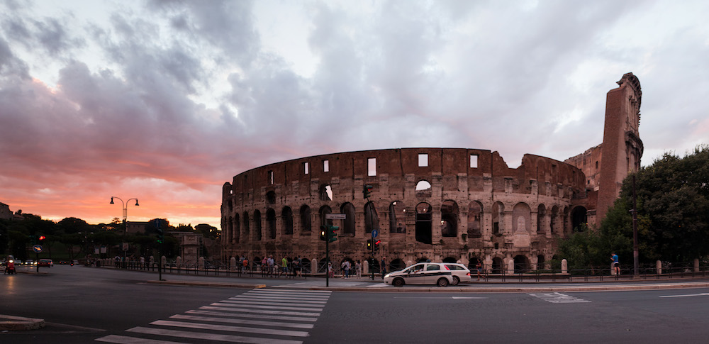 The Flavian Ampitheatre from the Piazza del Colosseo, Rome
Custom image classes are created using a loop in LESS, so I don’t have to type each size out individually:
.loopingClass (@index) when (@index >= 0) {

  @name: @base + (@index*@step);
  @width: @name * 1%;

  p.image-@{name} {
    // your resulting css
    font-size: 0.9em;
    text-align: right;
    color: gray;
    @media (min-width: 720px) {
      width: @width;
      position: relative;
      left: (-@width+100)/2;
    }
  }

  // next iteration
  .loopingClass(@index - 1);
}

// end the loop when index is 0
.loopingClass (0) {}

// "call" the loopingClass the first time with highest value
.loopingClass (@iterations);
(This is a simplified version of the actual code; there are classes for table and pre tags too, and the image-X class has two steps in size for devices over 900px and 1200px.)
Besides custom classes, Kramdown has a few other nice features1. It also supports Smartypants, so straight apostrophes and quotation marks are automatically replaced with their curly equivalents.
Bootstrap and Typography
As mentioned above, I like Bootstrap because it makes designing for all screen sizes not only practical, but easy. This is especially the case with Bootstrap 3. I also like Bootstrap because it gets the basics of web typography correct; the line height and space around elements is spot on. I chose Lato by Łukasz Dziedzic for the font; I had some misgivings over its limited character set (the own author’s name uses a character it doesn’t support!), but I wanted something free2 and liked the glyphs more than those of Open Sans.
Finally I set upon a fixed width design for blog articles on devices larger than mobiles. Robert Bringhurst’s The Elements of Typographic Style specifies 66 characters as the ideal line width for reading, and while I don’t necessarily subscribe to that, Bootstrap’s columns were either too wide (100+ characters) or too narrow at larger screen sizes to look sensible. Setting the line width at 450px made setting the image classes a bit trickier, but in the end that was still relatively straightforward. Paragraphs are ragged right aligned and text-rendering set to optimise legibility; while justified text is preferential in ideal situations, browsers are still prone to render justified text poorly.
Final Word
There are a few things I want to add, in particular support for HDPI screens and a few more custom image classes, but I’m very happy with how it’s turned out. Whether I manage to muster more than one post a year remains to be seen!