LaTeX is a document typesetting language that is used by anyone writing mathematics on a daily basis, however the default LaTeX document does not look all that great. I’ve created a preamble that I use for most of my work, that improves things in a number of areas.
Available on github, I’m going to document a few of its features here as well. Top of the pile are:
- Linux Libertine font. This is much more easy-on-the-eye than Computer Modern (the default font); all the maths that can be is in Libertine, anything that isn’t uses Cambria Math.
- Sans-serif headers. I’ve used Helvetica Neue in the file but this can be changed easily.
- Much nicer tables. Using the
booktabspackage, and old-style numerals from Libertine. - Example and Algorithm theorem styles, better to stand out among the text.
- Shaded blockquotes using the
shadedpackage, with extra-large opening quotes - Dual print/PDF use. By changing a variable you can have equal margins and coloured links for the PDF version of a document.
- Loads of convenient shortcuts, such as
\blackboard{R}already defined.
The preamble.tex file uses the fontspec package, requiring you to compile the document with LuaLaTeX or XeTeX.
A Closer Look At Fonts
I have something of an interest, bordering on obsession, with typography, and spent a long time before settling on something I was happy with. The Linux Libertine font project has produced a font that is not only really nice to look at, it has support for a large range of ligatures and other glyphs.
% Fonts
\usepackage{fontspec, unicode-math}
\defaultfontfeatures{Scale=MatchLowercase}

\setmainfont[Ligatures=TeX, Numbers=OldStyle]{Linux Libertine O}
\setsansfont[Mapping=tex-text]{Helvetica Neue}
\setmonofont{Consolas}

\newcommand{\dispnums}{\fontspec[Ligatures=TeX]{Linux Libertine O}}

\setmathfont{Cambria Math}
% use Libertine for the letters
\setmathfont[range=\mathit/{latin,Latin,num,Greek,greek}]{Linux Libertine O Italic}
\setmathfont[range=\mathup/{latin,Latin,num,Greek,greek}]{Linux Libertine O}
\setmathfont[range=\mathbfup/{latin,Latin,num,Greek,greek}]{Linux Libertine O Bold Italic}
\setmathfont[range={"221E}]{Linux Libertine O}% "0221E = \infty
% etc. (list should be completed depending on needs)
\setmathfont[range={"025BE}]{XITS Math} % \blacktriangledown
Much of this came from this answer on StackExchange. We begin by using the fontspec and unicode packages, and declaring our three main font types, before setting the math font to Cambria Math. The code then resets the math font for anything that Libertine has already, namely Latin and Greek letters, and numerals. \blacktriangledown (▼, used in the Example theorem style) isn’t covered by Cambria Math so we have to get it from XITS.
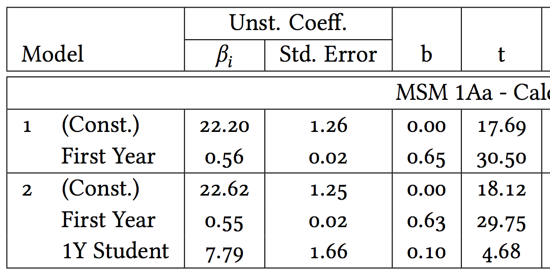
The line \newcommand{\dispnums}{\fontspec[Ligatures=TeX]{Linux Libertine O}} gives us the \dispnums command for mixing new- and old-style numerals. Note that the numerals in math are always new-style. This allows us to create tables that look like this:
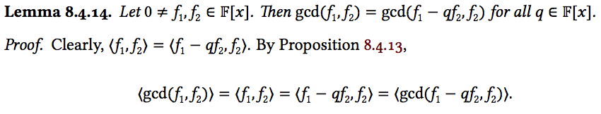
Using Libertine for most of our math looks like this:
Headings
The code above sets the san-serif font, but doesn’t tell LaTeX where it should be used. For this we use the titlesec package, and the \titleformat command, used as follows:
% Set the titles in sans font

\titleformat{\part}    % Level begin redefined
  [display]            % Paragraph shape (display, block, etc.)
  {\thispagestyle{empty} \Large \bfseries \sffamily}
    % Formatting of the whole title; label + text
  {\centering Part \thepart} % Label, usually \Xtitlename\ \theX
  {0pt}                      % Horizontal separation between label and body
  {\centering \Huge}         % Code preceeding the title body

\titleformat{\chapter}
  [display]
  {\thispagestyle{empty} \sffamily\large\bfseries}
  {\centering \chaptertitlename\ \thechapter}
  {0pt}
  {\centering \huge}
  []

\titleformat*{\section}{\sffamily\Large\bfseries}
\titleformat*{\subsection}{\sffamily\large\bfseries}
\titleformat*{\subsubsection}{\sffamily\bfseries}
Part and Chapter titles are centred on the page, to satisfy the requirements laid out by the University of Birmingham; removing the \centering command gets rid of this.
Block Quotations
Block quotes are handled with the snugshade environment defined by the framed package. The following code puts blockquotes into a frame with a coloured background, and adds an enormous “ at the left hand side.
\newfontfamily\quotefont[Ligatures=TeX]{Linux Libertine O}

% Command for the open quotes
\newcommand*{\openquote}{\tikz[remember picture,overlay,xshift=-15pt,yshift=-13pt]
     \node (OQ) {\quotefont\fontsize{60}{60}\selectfont``};\kern0pt}

% Wrap everything in its own environment
\newenvironment{shadequote}%
{\begin{snugshade}\begin{quote}\openquote}
{\hfill\end{quote}\end{snugshade}}
This results in the following (only the left hand side shown):
Note that to use this, you have to use the shadequote environment, instead of the standard quote environment.
Dual print/PDF use
Using the etoolbox package, it’s easy to set-up variables and use them in control structures as you would with any other computer language (TeX can do this out the box, but rather less easily). I’ve used this to handle the two types of documents that I want to output; the print version with its uneven margins and black references, and the PDF version with its colourful links and equal margins. This is done by adding the line:
\newcommand{\ispdfversion}{true}
to any document before the preamble.tex file is included. This in turn sets up a boolean variable, as follows:
\newbool{pdfversion}
\setbool{pdfversion}{\ispdfversion}

\ifbool{pdfversion}{
  \linespread{1.3}
  \setlength{\oddsidemargin}{0cm}
}{
  \linespread{2.0}
  \setlength{\oddsidemargin}{0.5cm}
}
Later lines set-up the hyperref package. If using this, be sure to delete all auxillary files created by LaTeX between changes to \newcommand{\ispdfversion}{true}.
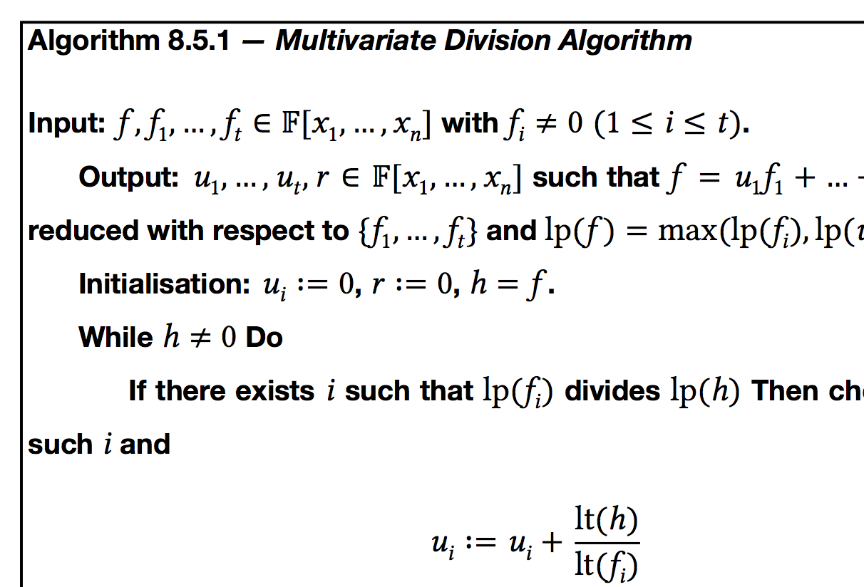
Example and Algorithm theorem styles
Theorem styles are a great way to make your document more intelligible, and easier on the eyes. I use two particular types that I’ve added to the preamble file; Example and Algorithm. Both are created using the thmtools package.
\newcommand{\exrule}{\rule{\textwidth-4em}{1pt}}

\declaretheoremstyle[
  spaceabove = 15pt, spacebelow=15pt,  % Space above and below the entire example
  headfont   = \sffamily\bfseries,  % Head font
  headformat = $\blacktriangledown$ \NAME~\NUMBER\NOTE\vspace{-3mm}, % LaTeX for the header; \NAME, \NUMBER and \NOTE supplied by thmtools, be careful with spacing
  headpunct  = \newline\exrule\newline,    % Punctuation after the head
  notefont   = \itshape,           % Font of the note (example name in this case)
  notebraces = {--- }{},           % Braces before and after note; again be careful with spaces.
  bodyfont   = \leftskip=2em \rightskip=2em \itshape \rmfamily \linespread{1.05}, % Body font and formatting
  preheadhook   = \Needspace*{4\baselineskip},  % Hook before the head; using needspace to ensure the head of the example is not on a separate page to its body.
  postheadspace = 0pt,              % Space after the head; we want none as we have a new line already
  prefoothook   = \ifhmode \hspace*{\fill}\newline \else \vspace{-5mm} \fi \exrule  % Hook for LaTeX code before the foot of the example (the space below it). If we are in horizontal mode, add a new line, otherwise just draw the ruled line. This makes 90% of the examples require no manual spacing.
  ]{examplestyle}

\declaretheorem[style=examplestyle, numberwithin=section]{example}
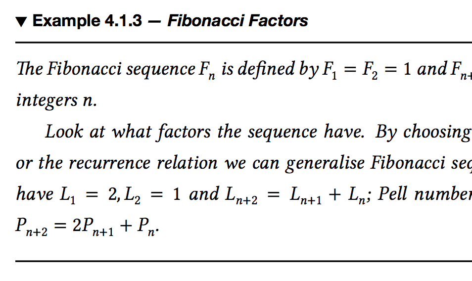
Above is the code for the Example style, Algorithm is set up in the same way. Here, we tell LaTeX to divide the number (and name if it has one) from the body of the example and set the body in italics. There are two other important features: firstly, the preheadhook option uses the needspace package to ensure that the title is not separated from the body by a page-break; secondly the prefoothook adds in a horizontal line after the body. When it does this, it checks to see whether TeX is in horizontal mode (i.e. immediately after an image or displayed math) and adds space accordingly. This mitigates 95% of spacing problems. When created, examples look like this:
I won’t cover Algorithm too but it is created in exactly the same way, and looks like this:
The box extends all the way around the body of the theorem style. One problem that remains unresolved is centering the whole thing in the page.
The file is on github and heavily commented; the geometry and headings satisfy the University of Birmingham’s requirements for thesis formatting. There is also an example PDF file to show the features of preamble.tex in use.